Bettie Best Vintage
Bettie Best Vintage was a proposed vintage-inspired clothing and accessories brand created by a veteran’s wife with a larger purpose behind it: to raise funds for veterans and their families, with the long-term vision of growing into a nonprofit that could help provide housing support for veterans, unhoused veterans, and families who lost spouses in the line of duty. Although the project was never launched, the brand exploration remains one of my favorite examples of creating a visual identity that feels expressive, memorable, and mission-connected. The goal was to develop something fun and stylish enough for a small apparel brand, while still feeling grounded and timeless enough to support a deeper charitable purpose.
The Challenge
The brand needed to balance two tones that could easily pull in different directions: playful vintage fashion and meaningful veteran support. Because the company was intended to sell clothing and accessories, the identity had to feel engaging, collectible, and merchandise-ready. At the same time, it could not feel gimmicky or disconnected from the founder’s larger purpose. The brand needed enough personality to stand out in a crowded apparel space, while still carrying the warmth, sincerity, and trust needed for a mission-centered business.
The Creative Direction
I developed a visual direction that leaned into vintage charm, expressive color, and reusable brand elements. The identity was designed to feel fun but not trendy — something with enough character to attract attention, but enough structure to remain usable across packaging, apparel, printed materials, and promotional products.
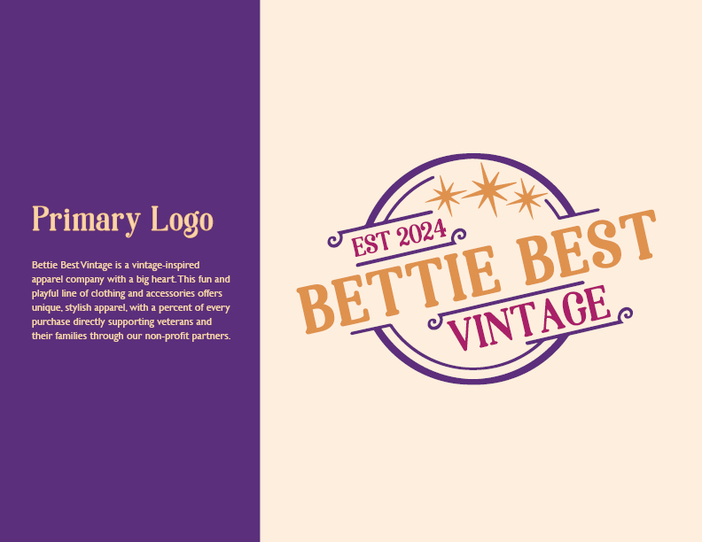
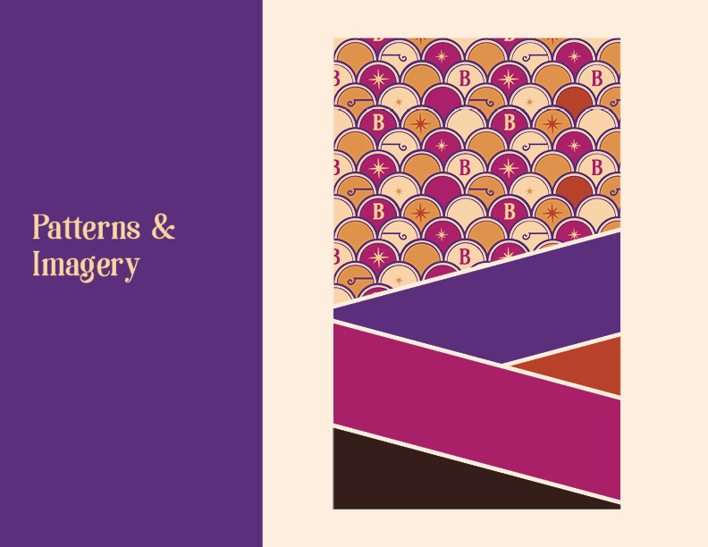
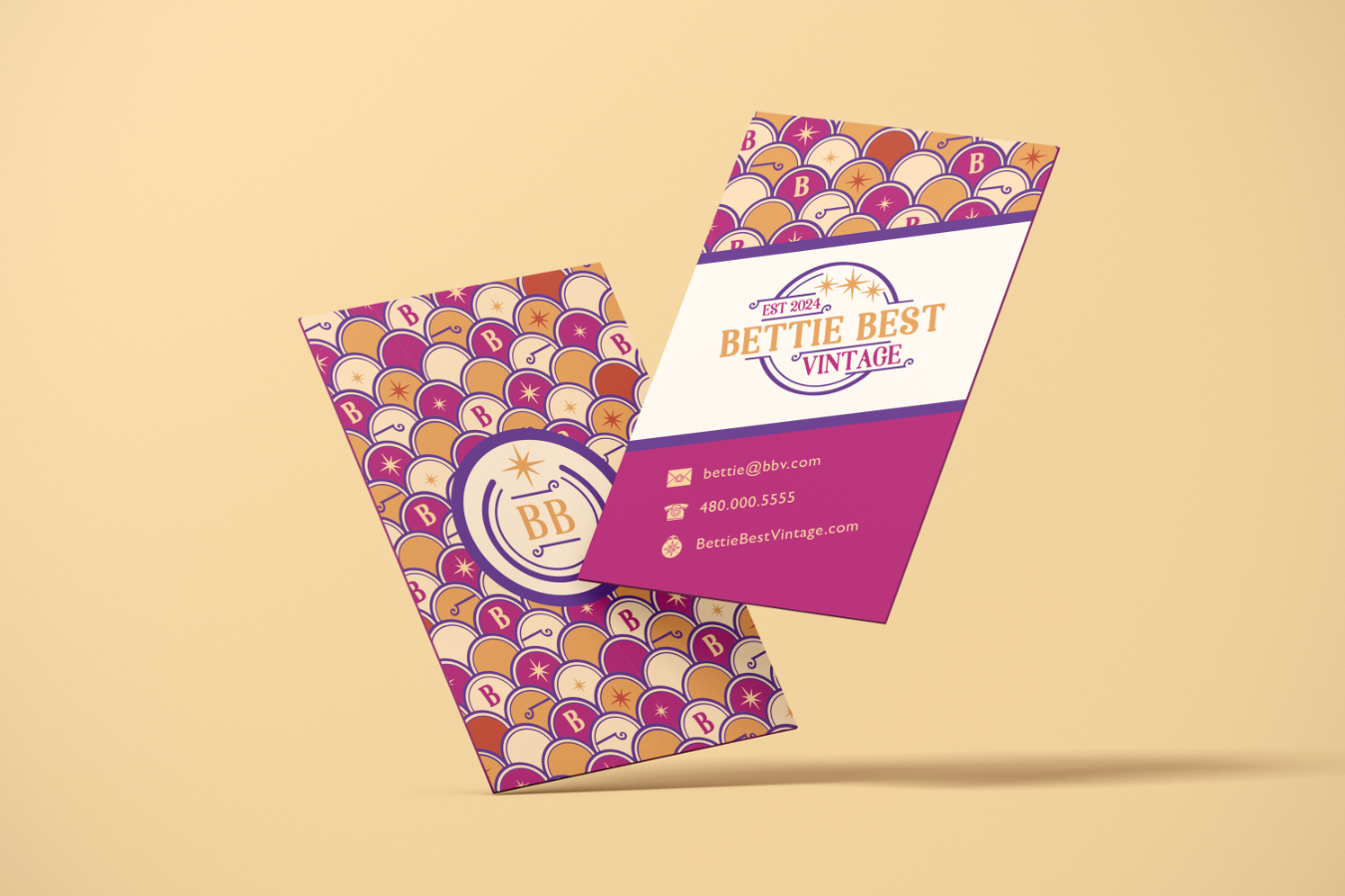
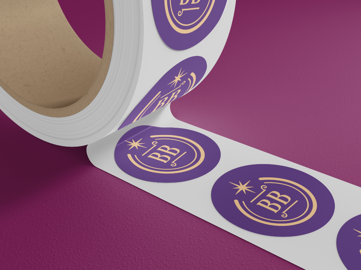
The BB logoform became the center of the brand system. I used it as both a recognizable mark and a jumping-off point for a custom scalloped pattern inspired by retro design. That pattern gave the brand a distinctive visual signature that could extend beyond the logo itself and create a more complete, ownable identity.
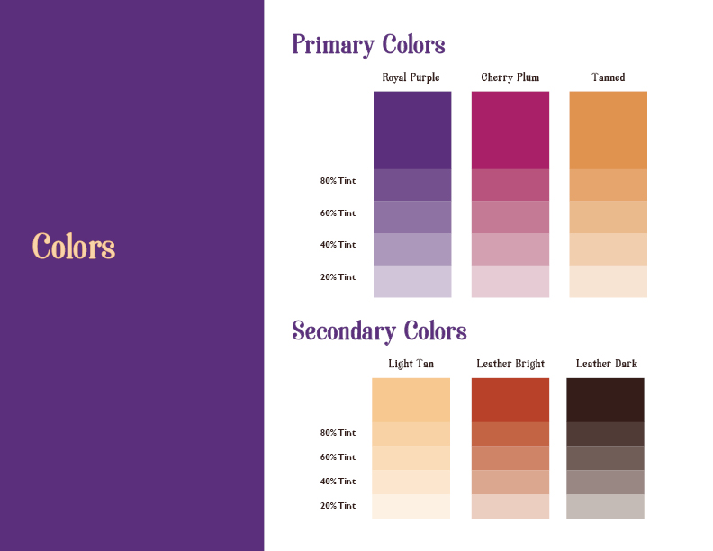
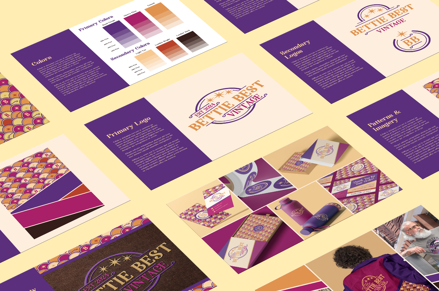
The color palette combined rich purple, cherry plum, warm tan, leather tones, and vintage-inspired accents to create a look that felt bold, warm, and nostalgic without becoming overly costume-like. Paired with expressive typography and decorative details, the result was a brand system that could feel boutique, personal, and polished.
Brand System and Applications
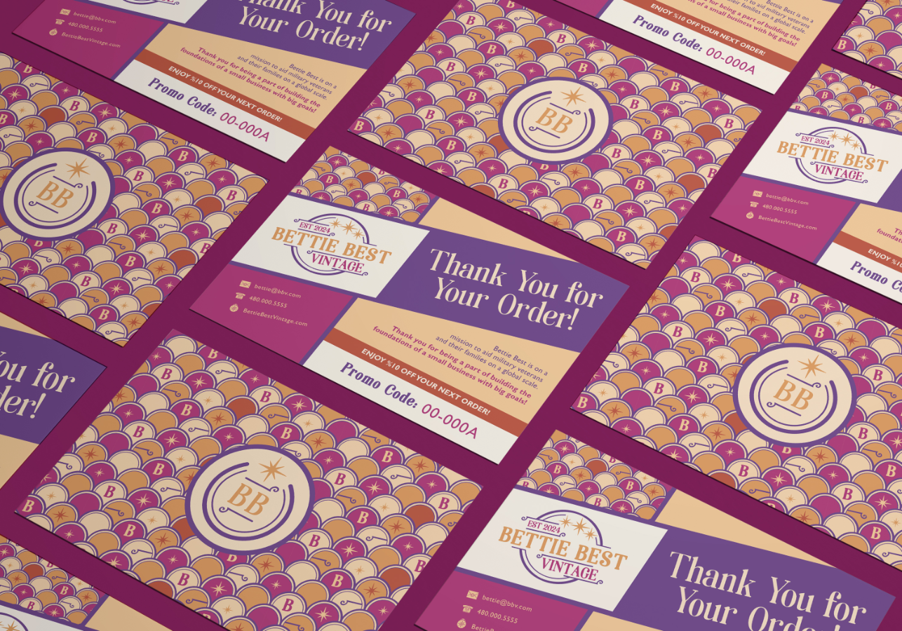
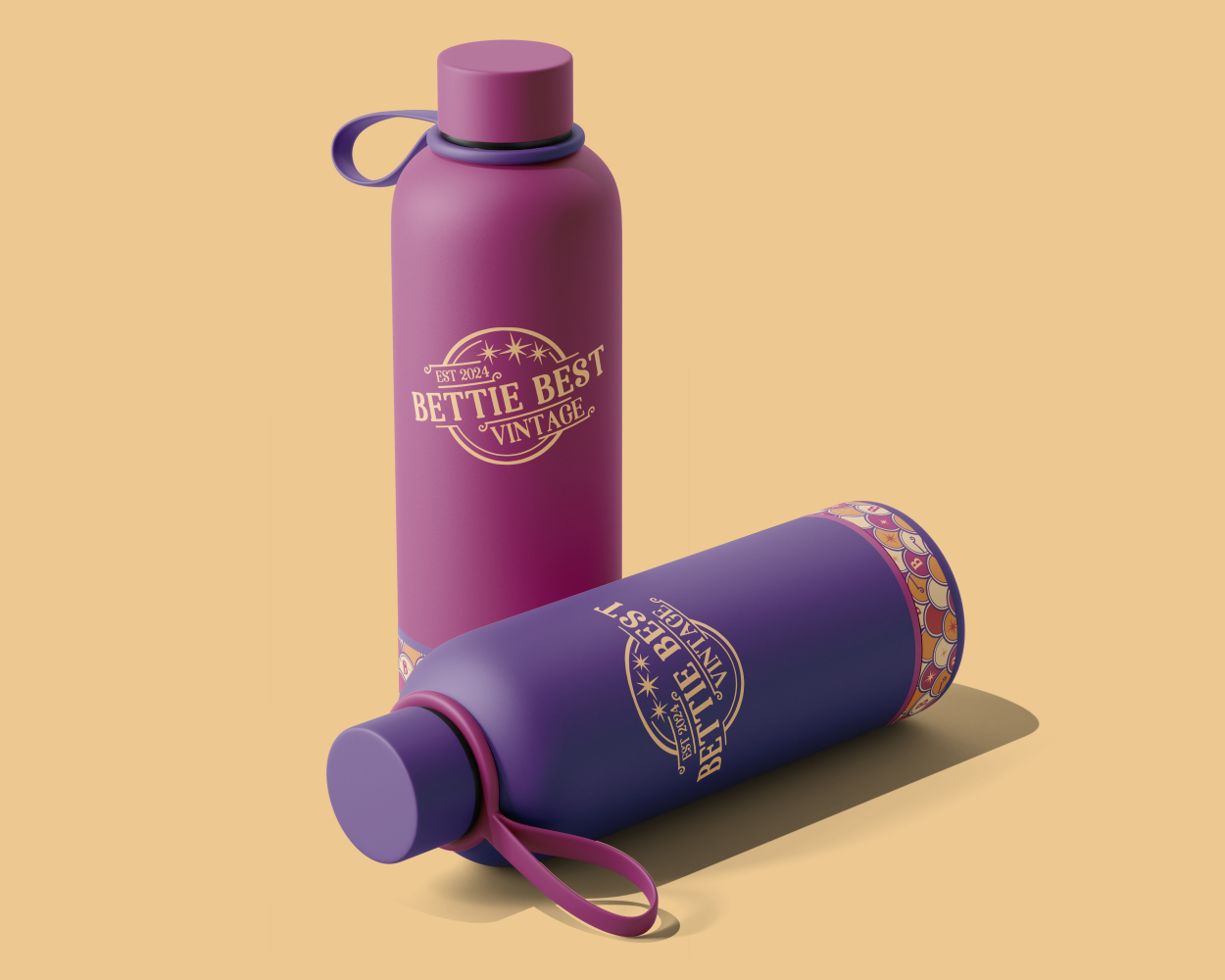
A key part of the identity was making the brand feel flexible and repeatable. The custom scalloped BB pattern was designed to work across marketing material, gift and merchandise accents, packaging details, and official wearable promotionals.
One of the strongest applications was the Bettie Best Founders Jacket concept. The jacket mockups showed how the brand could move from a flat identity into something people could wear, collect, and feel part of. That kind of application helped reinforce the idea that Bettie Best could become more than a clothing label — it could become a community-centered brand with a recognizable visual world.
The brand guide preview documented core logo usage, secondary marks, color tints, typography, patterns, imagery, and sample applications. This gave the concept a more complete and professional foundation, showing how the identity could scale if the company moved toward launch.
Outcome
While Bettie Best Vintage was ultimately never launched, the project remains a strong example of my ability to create a distinctive brand identity around both style and purpose. It demonstrates how I approach brand systems: not simply as logos, but as visual languages that can carry meaning across touchpoints. For Bettie Best, that meant building a playful, vintage-inspired identity with enough structure to support product packaging, apparel, print materials, and mission-driven storytelling.
The result was a warm, expressive, and merchandise-ready brand concept that honored the founder’s vision while creating a memorable visual foundation for future growth.