Greystone House
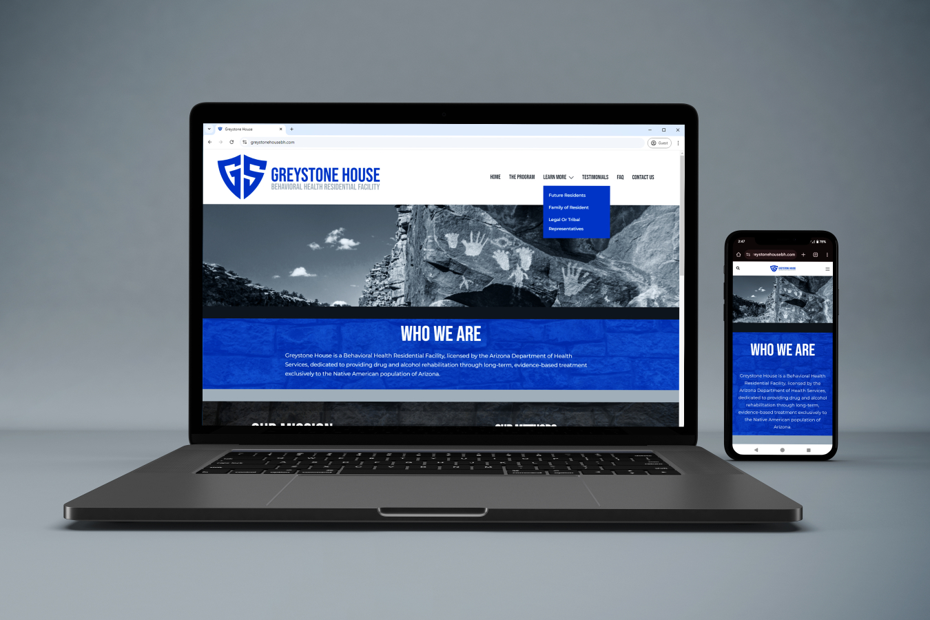
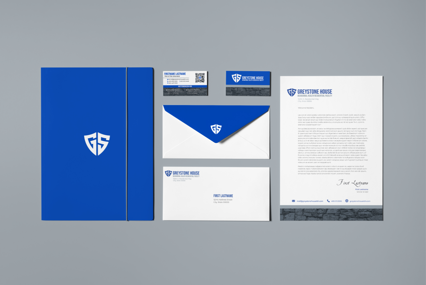
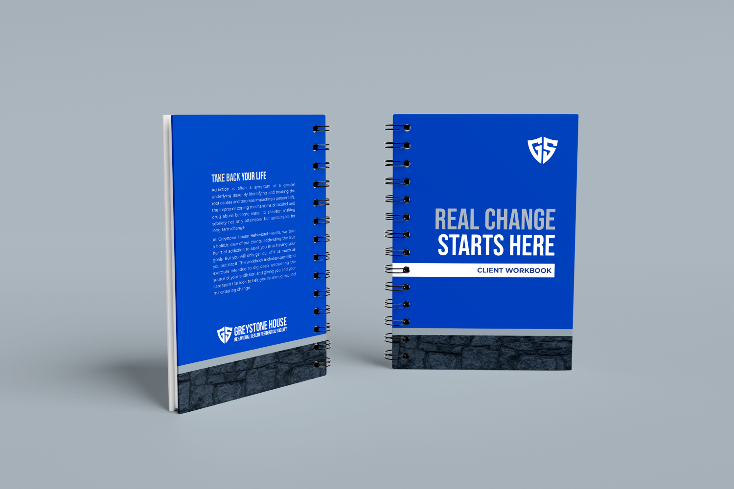
Greystone House Behavioral Health was an Arizona-based residential rehabilitation facility focused on long-term, evidence-based treatment for drug and alcohol addiction. The program was built around the belief that addiction is often a symptom of deeper trauma, and that lasting recovery requires stability, trust, cultural awareness, and a strong foundation for change. I was drawn to the purpose behind the organization and the care model they were building, particularly its focus on serving the unique needs of the Native American community. My work supported the launch and early communications of the program through website design, brand collateral, operational setup, and training materials.
The Challenge
Greystone House had an existing logo in place when I joined the project. While the logo was already established, it did not fully define the emotional tone, visual language, or broader brand system the organization needed to communicate its mission clearly. The challenge was to build a cohesive identity around that existing mark without discarding it. The brand needed to feel grounded, trustworthy, compassionate, and professional — while also reflecting the program’s emphasis on root-cause healing, long-term recovery, and rebuilding from a stronger foundation.
The Creative Direction
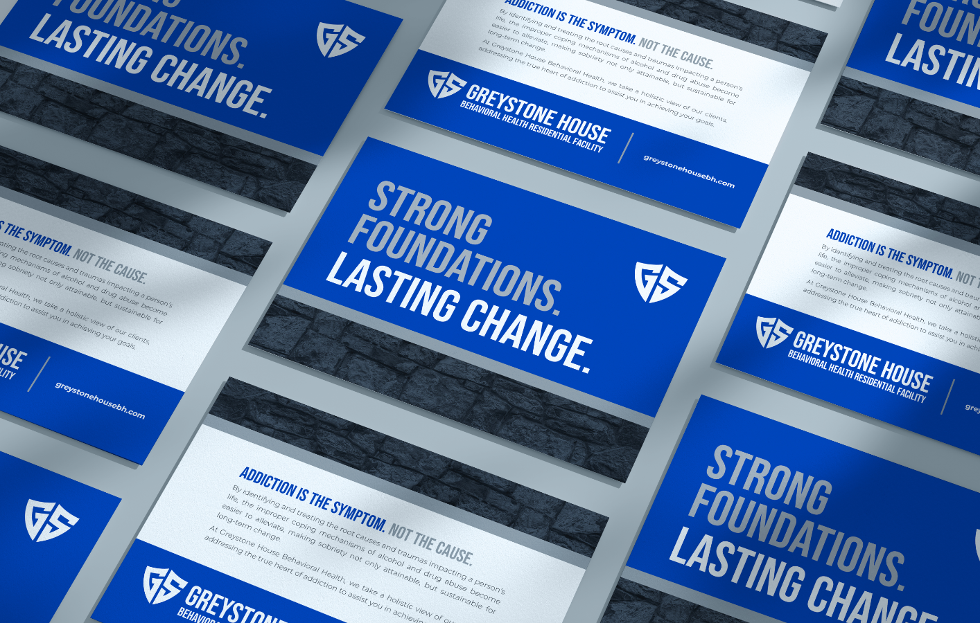
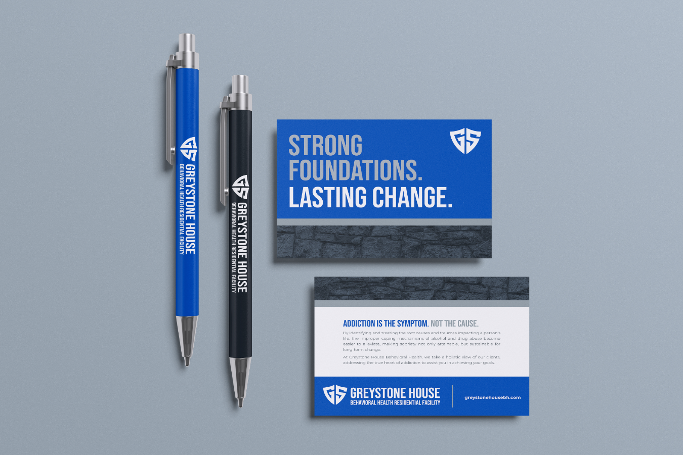
To strengthen the brand, I developed a visual and verbal direction centered on the ideas of foundation, solidity, connection, and renewal. The brick motif became a key visual device because it aligned naturally with the organization’s name and mission. It suggested structure, stability, protection, and the process of rebuilding one piece at a time. This gave the brand a more meaningful and memorable design language while helping compensate for the limitations of working within an existing logo system.
The overall direction balanced warmth with credibility. Because the organization served people and families navigating deeply sensitive situations, the design needed to avoid feeling cold, clinical, or overly institutional. At the same time, it had to communicate professionalism and trust to referral partners, families, and community stakeholders.
Design and Brand Execution
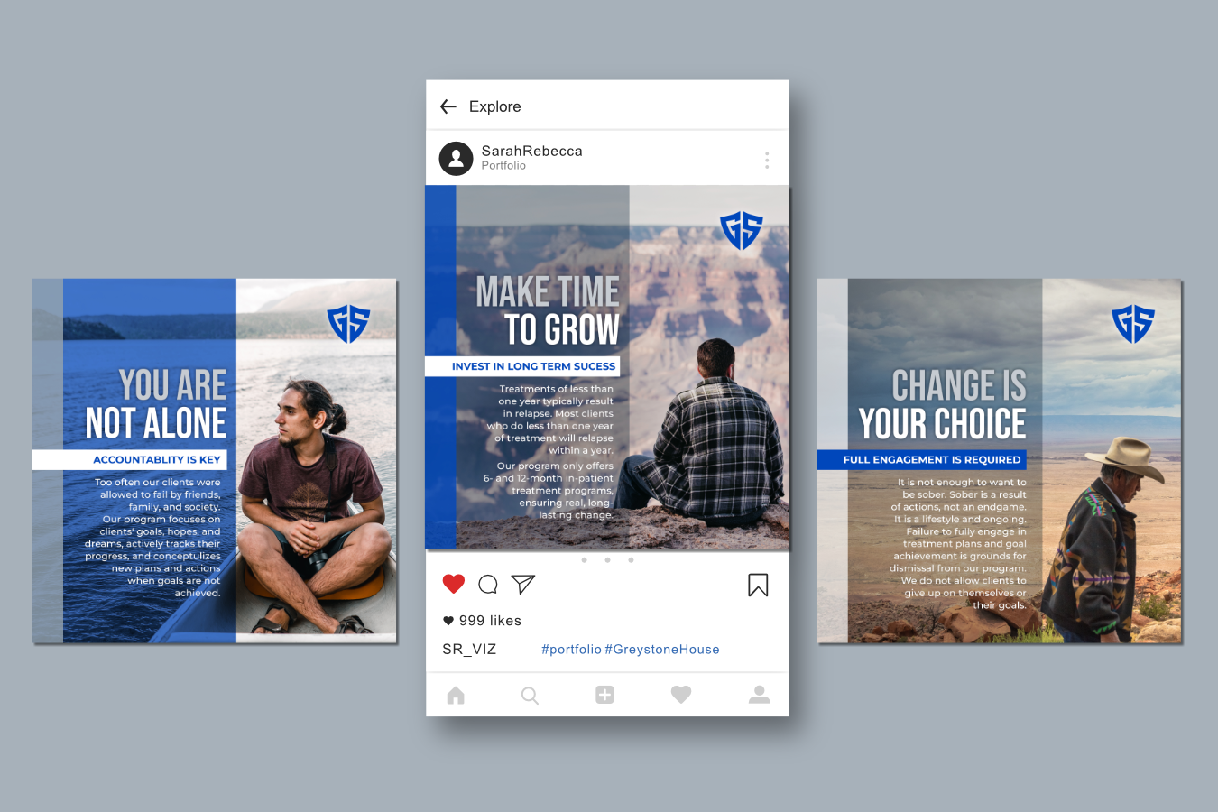
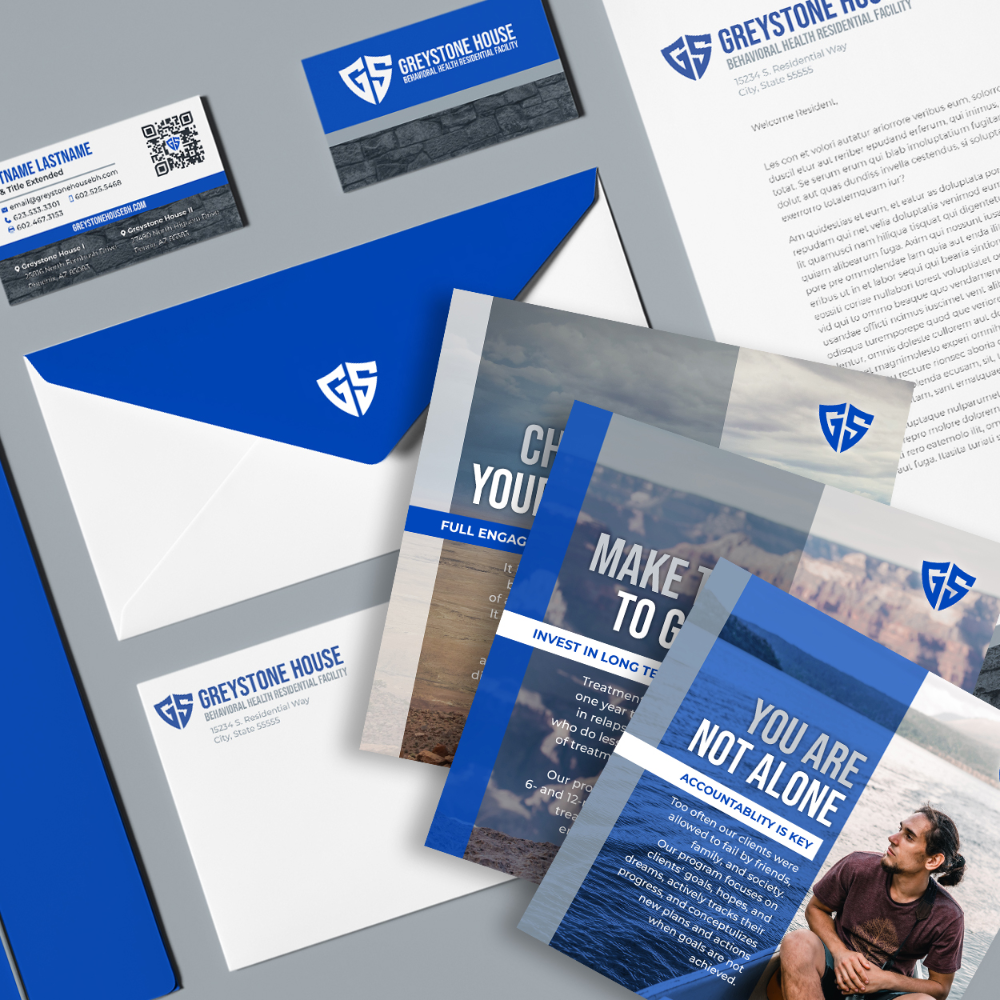
The visual system emphasized strength, stability, and human connection. I used the brick-inspired motif as a flexible design element across the website and collateral, helping create continuity between materials and reinforcing the program’s core message: recovery is built through structure, support, and care. The brand voice followed the same principle. Rather than focusing only on treatment services, the messaging emphasized rebuilding, trust, long-term healing, and the development of strong foundations. This helped position Greystone House as a compassionate, purposeful program rather than just another rehabilitation provider.
Technical and Operational Support
In addition to the creative work, I handled several foundational technical pieces needed to support the organization’s launch. This included setting up and managing Google Workspace, coordinating hosting through InMotion Hosting cPanel, and building the website in WordPress. I also designed training materials to help staff understand and use the systems being put in place. This ensured the work was not only visually cohesive, but also practical, usable, and sustainable for the team.
Outcome
Although the company was later sold, the Greystone House project remains one I’m proud of because it brought together many of the strengths that define my work: visual storytelling, brand development, digital design, technical setup, and mission-centered communication.
The project required me to create a stronger brand experience within real-world constraints, support a sensitive and meaningful service area, and build tools that helped the organization communicate with clarity and credibility. It reflects the kind of work I value most: using design to create structure, connection, and trust around something that matters.